
Note
This documentation is for a development version. Click here for the latest stable release (v0.5.0).
Creating spike raster plots
This example demonstrates how spike raster plots can be easily created with nengo_extras.
[1]:
%matplotlib inline
import matplotlib.pyplot as plt
import nengo
import numpy as np

from nengo_extras.plot_spikes import (
    cluster,
    merge,
    plot_spikes,
    preprocess_spikes,
    sample_by_variance,
)
Build and run a model
[2]:
with nengo.Network(seed=1) as model:
    inp = nengo.Node(lambda t: [np.sin(t), np.cos(t)])
    ens = nengo.Ensemble(500, 2)
    nengo.Connection(inp, ens)

    p = nengo.Probe(ens, synapse=0.01)
    p_spikes = nengo.Probe(ens.neurons)
[3]:
with nengo.Simulator(model) as sim:
    sim.run(5.0)
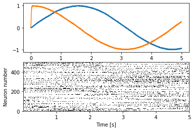
Simple spike raster plot
We can use the plot_spikes function to create a simple spike raster plot.
[4]:
plt.figure()

plt.subplot(2, 1, 1)
plt.plot(sim.trange(), sim.data[p])

plt.subplot(2, 1, 2)
plot_spikes(sim.trange(), sim.data[p_spikes])
plt.xlabel("Time [s]")
plt.ylabel("Neuron number")
[4]:
Text(0, 0.5, 'Neuron number')
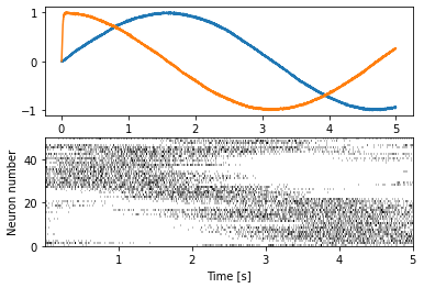
Improved plot
We can create a more informative plot with some preprocessing of the spike trains. Specifically, we subsample interesting ones and sort them by similarity. Usually, the preprocessing done with the preprocess_spikes function works well.
[5]:
plt.figure()

plt.subplot(2, 1, 1)
plt.plot(sim.trange(), sim.data[p])

plt.subplot(2, 1, 2)
plot_spikes(*preprocess_spikes(sim.trange(), sim.data[p_spikes]))
plt.xlabel("Time [s]")
plt.ylabel("Neuron number")
[5]:
Text(0, 0.5, 'Neuron number')
There are some arguments that can be passed to preprocess_spikes for fine tuning. But sometimes it is necessary to change what things are done during the preprocessing. The nengo_extras.plot_spikes module provides a number of lower level functions to construct specific preprocessing pipelines. This example recreates what preprocess_spikes does.
[6]:
plt.figure()

plt.subplot(2, 1, 1)
plt.plot(sim.trange(), sim.data[p])

plt.subplot(2, 1, 2)
plot_spikes(
    *merge(
        *cluster(
            *sample_by_variance(
                sim.trange(), sim.data[p_spikes], num=200, filter_width=0.02
            ),
            filter_width=0.002
        ),
        num=50
    )
)
plt.xlabel("Time [s]")
plt.ylabel("Neuron number")
[6]:
Text(0, 0.5, 'Neuron number')
